


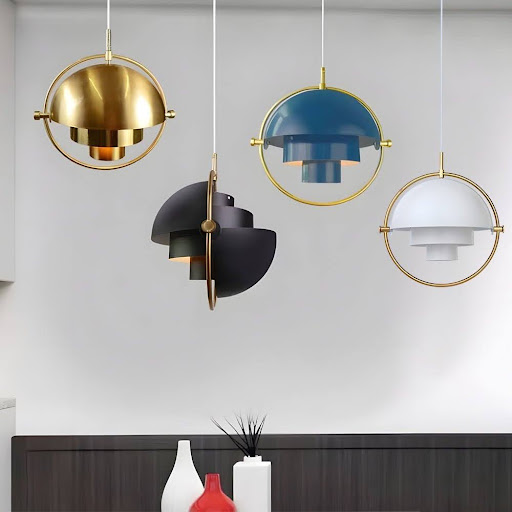
Lighting is often chosen for practical reasons, yet a pendant also behaves like a piece of decoration. Hanging within the normal line of sight, it can introduce colour, define a dining area, and give an otherwise simple room a clear focal point. Changing a pendant can therefore alter the mood of an interior without replacing furniture or repainting every wall.
Blue and black-and-gold fixtures create especially distinctive effects. Blue can feel calm, expressive, or coastal depending on its shade, while black and gold offer contrast and a sense of polish. Neither choice belongs to only one design style. The right option depends on the atmosphere you want, the finishes already in the room, and how noticeable the fixture should be.
Begin With the Mood, Not the Trend
Before comparing shapes and finishes, decide how the room should feel. A kitchen used for relaxed breakfasts may suit a softer, friendlier colour. A dining area designed for evening entertaining might benefit from stronger contrast and a more dramatic focal point.
Consider the view from adjoining rooms as well. In an open-plan home, the pendant may be visible from the sofa, hallway, and kitchen. Its colour should contribute to the wider interior rather than looking attractive from only one angle.
What Blue Pendant Lights Bring to an Interior
Blue is remarkably flexible. Pale and dusty blues can create a gentle, airy impression, while navy and cobalt shades add depth. Teal introduces a greener note that pairs well with timber, brass, and natural textures. The material and finish matter too: glossy blue feels crisp and reflective, whereas a matt or ceramic surface looks softer and more tactile.
A carefully chosen Blue Pendant Light can enliven a neutral kitchen without overwhelming it. Above a pale island, blue adds a controlled splash of colour; in a room with wood cabinetry, it can create a pleasing contrast while retaining a comfortable atmosphere. Repeating a similar blue in artwork, cushions, or tableware helps the fixture feel connected to the room.
Why Black and Gold Feels So Distinctive
Black creates definition, while gold adds warmth and catches the light. Together they can make a pendant feel graphic and refined. The combination suits contemporary rooms, Art Deco-inspired schemes, and transitional interiors that mix modern lines with classic details.
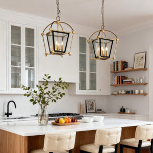
A Black and Gold Pendant Light works particularly well when the room already includes small black and warm-metal details. It may echo cabinet handles, tapware, chair frames, or picture frames without requiring every finish to match perfectly. A mostly black exterior with a gold interior can also reflect a warmer glow onto the surface below.
Use Existing Finishes as Clues
Look at the most permanent elements in the room: cabinetry, flooring, worktops, and large furniture. Blue often works beautifully with white, grey, cream, timber, and warm stone. Black and gold can connect dark hardware with warmer materials such as oak, walnut, brass, or veined stone.
Choose the Right Size and Number
A beautiful colour cannot correct poor proportions. Measure the island or table and note the ceiling height before selecting a fixture. A small pendant may look lost above a broad surface, while several large shades can crowd the view and make conversation across an island uncomfortable.
There is no universal rule that every island needs three pendants. Two larger fixtures can appear calmer and more generous; three compact ones can create an even rhythm. Leave enough visual space between them and around the ends of the surface.
Think About the Light as Well as the Look
Opaque shades direct more light downwards, making them useful above worktops and tables. Clear glass spreads light more widely but can reveal the bulb and create glare. Frosted glass softens the source, while reflective interiors may increase the sense of warmth.
Dimming provides flexibility for rooms used throughout the day. Brighter light can support cooking or homework, and a lower setting can create a more relaxed atmosphere during dinner. Keep nearby light sources at a compatible colour temperature so the room feels cohesive.
Which Colour Should You Choose?
Choose blue when the room needs freshness, calm, or a personal touch of colour. Select black and gold when you want stronger definition, warmth, and a more dramatic focal point. If both appeal to you, look at the room’s existing balance: a highly neutral space may welcome blue, while a colourful room might benefit from the structure of black and gold.
The best pendant is not simply the most fashionable one. It should suit the scale of the room, provide useful light, and feel connected to the way you live. When colour, proportion, and illumination work together, a pendant becomes a small change with an impressively large effect.
